
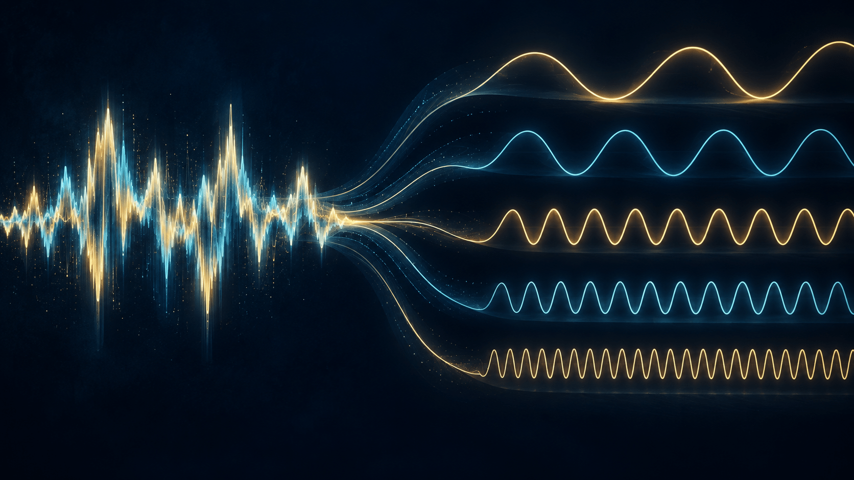
Play a chord and several notes arrive together. Look at a recording of that moment and you may see one complicated waveform. The picture can seem almost unhelpful: where did the individual sounds go? A musical experience that feels easy to recognize has become a line whose movements are difficult to interpret.
Grant Sanderson’s 3Blue1Brown video, But what is the Fourier Transform? A visual introduction., explores how a signal can be described through its component frequencies. His animated explanation begins with sound, giving an approachable entrance to an idea used far beyond music. For listeners, it also opens a more focused question: what can analyzing a recording reveal about a note, and what will still require listening?
A different view of the same sound
A waveform follows a signal through time. A frequency description asks which oscillations contribute to it. Sanderson builds the connection through a visual device: winding a graph around a circle at different rates and examining how its contributions balance. A matching frequency produces a distinctive response. His creator-published lesson develops that intuition into the fuller mathematics, including the two components needed to describe a complex-valued transform.
The important first step is a change of question. Imagine receiving a written description of every moment in an orchestral rehearsal. It might tell you what happened in sequence, yet you could still want a separate account of which musical parts were present. Different descriptions make different relationships easier to inspect.
That analogy has limits. A frequency component does not arrive with an instrument’s name attached. The transform reveals mathematical structure in a recording; deciding which performer or object produced a feature requires more context. Keeping that distinction in mind prevents a useful analytical tool from acquiring powers it does not possess.
One musical note can contain many components
A sustained instrumental note often contains a fundamental and a family of higher-frequency components. The UNSW Music Acoustics group explains the harmonic case through whole-number relationships: if the fundamental frequency is f, the harmonics occur at f, 2f, 3f and so on. Real instruments may be approximately harmonic, and some, especially percussion, need a different description.
Consider an idealized sound with components at 100, 200 and 300 cycles per second. Those numbers describe a relationship, rather than three separate musicians. A listener may experience the combination as one tone with a particular character. The example is a simple model, not a measurement of a specific instrument.
Why, then, can two instruments playing a similar pitch sound different? UNSW’s explanation of spectrum and timbre identifies both the distribution of component strengths and the sound’s changing envelope as important. How a note starts, continues and fades belongs in the investigation alongside its frequencies.
This gives listening a second dimension. Instead of asking only which note is played, ask how it arrives. A sharp beginning and a lingering tail can be as interesting as the pitch itself.
Editing a frequency changes a musical decision
Sanderson uses an unwanted high-pitched sound to illustrate a practical application: identify a frequency component, reduce it and reconstruct the signal. The example shows why changing perspective can make an otherwise awkward problem easier to describe.
Audio software makes related operations available to ordinary users. The Audacity manual’s spectral-editing guide describes selecting a frequency range within a time range, then applying appropriate effects. It also warns that a steady unwanted frequency with few harmonics is a much easier target than complicated sounds such as traffic.
The musical question comes after the selection. Which qualities are you trying to preserve? If desired material occupies the same range as an unwanted sound, reducing that range can affect both. A cleaner-looking display does not by itself establish a better result.
Imagine editing a rehearsal recording that contains a faint whine. One version may suppress the distraction aggressively; another may leave some of it to preserve the surrounding tone. Comparing the versions makes the trade-off audible. The goal should come from the recording’s purpose, with the graph helping you investigate rather than choosing the outcome for you.
Every graph comes with viewing choices
A spectrum display can appear wonderfully definite, with crisp peaks and numbered axes. Yet its appearance depends on how the analysis is performed. Audacity’s Plot Spectrum documentation explains that larger analysis blocks give finer frequency resolution while covering a longer interval of audio. Its display also combines information from the selected material.
That matters when comparing a brief attack with a sustained note. Ask whether you are examining a small event, an average across several events or a much longer musical passage. Changing the question without changing the interpretation can make two correct displays seem contradictory.
Before drawing a conclusion, write down what was selected and which settings were used. A useful comparison holds those choices steady, or explains why they changed. This modest habit makes an experiment easier to repeat and its limits easier to recognize.
For a musician, precision here need not mean turning every session into laboratory work. It can simply mean resisting the temptation to treat the most impressive-looking plot as the most revealing one. Choose a view that answers the question you actually have.
A spectrum cannot settle musical taste
Once we can identify orderly frequency relationships, it is tempting to make a further leap: perhaps the mathematics tells us which sounds everyone should enjoy. That question needs evidence about listeners, not just a description of waves.
A 2016 study by Josh McDermott and colleagues compared responses to sounds among several U.S. and Bolivian populations. Tsimane’ participants with limited exposure to Western music did not show the same preference for consonant chords as the U.S. groups, despite being able to distinguish relevant acoustic differences. The result demonstrates a distinction between detecting a relationship and preferring it.
The study concerns particular populations and listening tasks. It does not settle every question about biology, experience or musical enjoyment. It does give us a reason to be careful when turning a familiar aesthetic response into a universal rule.
For everyday listening, that caution is liberating. You can learn what makes a sound distinctive while remaining free to dislike it, or enjoy a rough, unstable texture without treating your preference as a failure of understanding. Description and judgment each have their place.
Return to the sound with a better question
Try a small listening exercise with two recordings of a similar sustained pitch. Keep the volume comfortable and notice the beginning, the steady portion and the ending. Describe what you hear before looking at any analysis. If a spectrum display is available, use it to investigate one observation rather than search for a verdict.
Choose examples that make comparison manageable. A short solo note is an easier starting point than a dense chorus with several instruments. If the first attempt raises more questions than it answers, keep one observation and return to it. You are building a vocabulary for attention, and a precise question is already a useful result.
The benefit of this approach is specific: it gives you more ways to ask why a sound caught your attention. Sanderson’s visual mathematics supplies an inviting starting point, while the music supplies the questions worth pursuing. A familiar note can reward a closer listen.
Original video: But what is the Fourier Transform? A visual introduction., by Grant Sanderson, 3Blue1Brown. This article adds independent musical analysis and research context.